
Website Usability Tips for Smoother Customer Experience
The digital world of today is bustling with websites, each vying for a moment in the spotlight. Yet, what truly sets a website apart isn’t just the array of colors or the punchy content—it’s the ease with which users can navigate and savor the experience. In our pursuit to serve customers better, we must focus on the pathways paved within our websites. After all, a seamless user experience can turn a casual visitor into a loyal customer.
1. Clarity Is King
Let’s start with the foundation—clarity. Your website should be a beacon of light in a sea of digital chaos. This means clear headlines, understandable content, and intuitive navigation. When users land on your site, they should know right off the bat what you’re offering. Use language that’s conversational and direct. Simplify your sentences. Because, honestly, who wants to wade through a thicket of jargon?
2. Speed Matters
Speed is not just for race cars. In the world of websites, a few seconds can feel like an eternity. If your site is slow to load, users will bounce faster than a rubber ball. Optimize your images, streamline your code, and consider a quality hosting service. Because when a page loads swiftly, you’re telling your visitors, “I value your time.”
3. Mobile-First is a Must
Today, the smartphone is akin to a Swiss Army knife—a tool for countless tasks. Thus, a website that excels on mobile is not a luxury, but a necessity. Ensure that your site is responsive, which means it looks good on any device. Buttons should be thumb-friendly, and text easily readable without zooming in. The mobile-first approach is not just about accessibility; it’s about respecting the shift in how people access information.
4. Navigation Should Be a Breeze
Imagine walking into a store where the aisles are a maze—you’d likely walk right out. The same goes for your website. Your navigation menu should lead users smoothly from point A to point B. Regularly test your site’s navigation. Make sure that your most important content is no more than a few clicks away. Dropdown menus might look sleek, but they can be tricky on touch screens, so use them judiciously.
5. The Power of Visual Hierarchy
Visual hierarchy is essentially a guide to show users where to look first, second, and so on. Use size, color, and contrast to direct attention. Larger, bolder elements are like shouting, “Hey, look here!” while smaller ones are like a gentle whisper. Play with these visuals to lead users through your site, making sure you’re highlighting the most critical parts of your message.
6. Simplicity Sells
Simplicity isn’t about stripping everything away until it’s bare. It’s about presenting just enough to guide users without overwhelming them. Whether it’s design, content, or features, always ask yourself, “Is this necessary?” If not, it may be time to let go. A clean layout, space between elements, and a focus on essentials can make the user’s journey feel effortless.
7. Color and Contrast
Color isn’t just for decoration; it’s a communication tool. Contrast can help you highlight important buttons or calls to action. For example, a bright button on a subdued background is like a beacon inviting a click. But remember, keep it accessible. Not everyone sees colors the same way, so ensure there is enough contrast for those with visual impairments or color blindness.
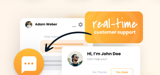
8. Images and Icons Speak Volumes
A picture says a thousand words, and on a website, it can say even more. Choose images that resonate with your audience and tell your brand’s story. Icons, on the other hand, can condense concepts into a digestible snapshot, but they should be used thoughtfully. Too many icons can clutter the space, and mistaking their meaning can frustrate users. Quality over quantity is the rule here.
9. Friendly Forms
Forms should be the bridges that connect users to your services, not barriers. Keep them short and sweet—the fewer fields, the better. Ask for essential information only, and always include clear error messages to help users correct mistakes. Autocomplete functions can save users time, and a clear call to action (CTA) button can clinch the deal.
10. Test, Feedback, Improve
Finally, what’s a great website without a little testing and feedback? Gathering insights from real users can shine a light on areas you may have overlooked. Conduct usability tests, gather feedback through surveys, and analyze user behavior through heat maps and analytics. This feedback loop is essential for continual improvement, ensuring your website remains a friendly destination for visitors.
In conclusion, remember that your website is like your digital handshake—it’s often the first impression you give. Crafting a website that’s effortlessly navigable, fast, and enjoyable is the cornerstone of a strong online presence. Apply these usability tips, and you’ll be well on your way to providing a smoother customer experience, one that impresses visitors and transforms them into faithful customers. Every little change matters, nudging your website closer to perfection. So, take these tips, tweak your site and watch your visitors turn into champions of your brand.
Building a seamless customer journey online is an ongoing process. Keep at it, and know that with every improvement, you’re making the web a better place, one satisfied user at a time.