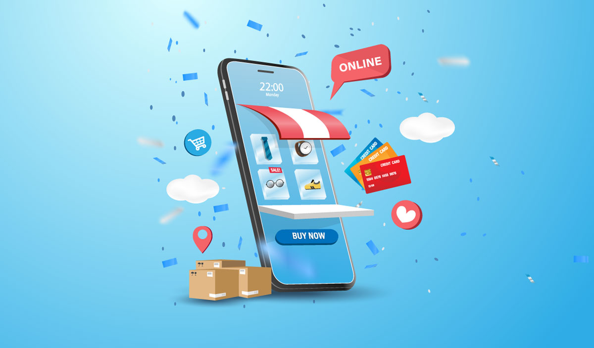
Introduction to Mobile Sales Optimization
Welcome to the digital frontier, where your storefront isn’t only brick and mortar, but also pixels on a screen. With more and more customers tapping and scrolling through their phones to shop, it’s imperative that your store is not just present, but performs spectacularly on mobile devices. But how can one ensure that their online store is not merely surviving but thriving in the mobile marketplace? Let’s dive into the world of optimization for mobile sales — simplifying technology to boost your business.
The Rise of Mobile Shopping
Think for a moment about the device you last used to shop online. Chances are, it was a smartphone. That’s right, these pocket-sized wonders have transformed how consumers engage with brands and make purchases. With the rise of mobile shopping, optimizing your online store for mobile sales is more than a luxury — it’s a necessity.
User-Friendly Design: The Heart of Mobile Optimization
First impressions matter, and your mobile site is no exception. A user-friendly design ensures that customers find what they’re looking for without frustration or confusion. The key is simplicity and efficiency. Ensure that pages load quickly, images are clear, and navigation is intuitive. Large buttons, easy-to-read text, and minimalistic menus can go a long way in keeping customers engaged and ready to hit that ‘buy’ button.
Speed is Your Best Friend
In the world of mobile browsing, speed is king. A slow-loading page isn’t just annoying; it can be a deal-breaker. Data shows that even a one-second delay can drastically reduce customer satisfaction and lead to a significant drop in sales. This is why ensuring that your mobile site loads swiftly is critical. Compressing images, optimizing code, and using a content delivery network can noticeably reduce those loading times.
Responsive Design: Adapting to Any Screen
People use a variety of devices with different screen sizes to shop online, and your store needs to look good on all of them. Responsive design is the solution. This approach ensures that your store automatically adjusts to fit the device it’s being viewed on, providing an optimal experience for every user, be it on a phone, tablet, or desktop.
Mobile Payment Solutions: The Check-Out Game Changer
The check-out process on mobile needs to be as smooth as silk. The fewer taps and types, the better. Incorporate mobile payment solutions like Apple Pay, Google Wallet, or PayPal One-Touch. These platforms not only expedite the checkout process but also provide the security that users expect when making a transaction.
Intuitive Search and Filters
With smaller screens, the importance of intuitive search and filter functions cannot be understated. Customers want to find their desired products without a magnifying glass. Ensure that your search bar is easily accessible, and filters help refine the results quickly. Auto-suggest functions can also be incredibly helpful by predicting what a customer is looking for as they type.
Personalization: A Touch of Magic
Personalization can make a customer’s shopping experience memorable. Using data to tailor the shopping experience on mobile devices means showing users products that suit their tastes, search history, or purchasing behavior. This can manifest in personalized product recommendations, targeted promotions, or special discounts that appear right in their hands.
Seamless Social Media Integration
Social media and mobile shopping go hand in hand. A seamless integration between your store and social media platforms makes it easier for customers to share their favorite products with friends and family, thereby extending your reach. Ensure that social sharing buttons are visible without being intrusive, and consider incentivizing shares with discounts or promotions to create a buzz around your products.
Captivate with Content
Content and commerce should be close companions in the mobile shopping journey. Engaging, relevant content can draw in customers in a way that a simple catalog cannot. Whether it’s through compelling product descriptions, vibrant images, or interactive videos, content that tells a story enhances the user experience and can stimulate sales.
Essential Security Measures
In the digital shopping realm, security is paramount. Customers need to feel confident that their data is safe. Ensure that your mobile store is using secure, encrypted protocols like HTTPS. Displaying security badges prominently can also reassure customers, reducing cart abandonment and bolstering trust in your brand.
Testing: The Continuous Improvement Tool
Even after you’ve implemented all these strategies, the work isn’t over. Consistently testing and adjusting your mobile store based on real user data is essential. Use A/B testing to see which features, layouts, and content resonate best with your customers. Monitoring performance and collecting feedback will guide you in refining the user experience continuously.
Conclusion: A Mobile-Optimized Journey
Optimizing your store for mobile sales is a journey — one that requires attentiveness to trends, dedication to user experience, and a commitment to continuous improvement. By focusing on user-friendly design, speed, responsiveness, intuitive functionality, and security, you can attract, engage, and convert mobile shoppers with remarkable efficiency. The mobile space presents a vast opportunity for businesses willing to embrace these changes and invest in their digital storefronts.
Remember, every detail counts in crafting a mobile experience that not only navigates the customer successfully from homepage to checkout but does so with such finesse that they’ll return time and again. Begin this optimization adventure today, and watch your mobile sales soar to new heights!