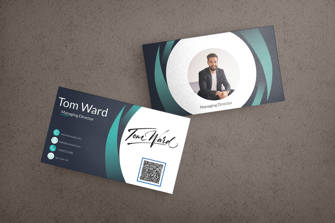
Business Card Design Tips for Maximizing Your Impact
In the world of networking, first impressions are everything and your business card is often the first piece of your professional story that people get to see. Just think about it – that little card not only carries your contact information; it’s a snapshot of your brand identity. So, grabbing attention and making that impact is key. Let’s dive into some tips to help you design a business card that packs a punch and leaves a lasting impression.
Understanding the Power of Simplicity
When it comes to design, less is often more, especially with business cards. A cluttered card can be overwhelming and confusing. Aim for a design that’s simple and uncluttered. This doesn’t mean it has to be boring! A simple design can be striking and memorable. Focus on the essentials: your name, title, company, and contact information. Use a clean, easy-to-read font, and leave plenty of white space, so each element has room to breathe.
Make It Reflect Your Brand
Your business card should be a mini representation of your brand identity. This means using your brand’s colors and logo consistently. But don’t just slap on a logo and call it a day. Ensure that the colors, fonts, and imagery you use are in line with your overall brand style and message. You want the card to tell your brand’s story at a glance.
Choosing the Right Material
Who says business cards have to be boring old paper? Experiment with different materials that speak to your brand. Are you all about sustainability? Consider recycled paper or even plantable seed paper. If you’re in the tech industry, maybe a sleek metal or plastic card is more your speed. The material can be part of the message you’re trying to convey, so choose wisely.
Get Creative with Shapes and Sizes
The standard rectangle isn’t the only shape in town. Circular cards, square ones, even custom die-cut shapes that relate to your business can stand out from the stack. Keep in mind though, if it’s too out there, it might be hard for someone to keep in their wallet or cardholder, so balance creativity with practicality.
Add a Special Finish
Ever considered a dash of uniqueness with a special finish? It could be a glossy varnish, a spot UV coating that adds shine and texture to certain parts of the card, or even embossing that raises parts of the design like your logo. These finishes can add that ‘wow’ factor and make your card more tactile and visually striking.
Double-Sided Design
A two-sided card offers more space for information. Use the front for your main details and the back for something more – maybe a calendar, an appointment reminder, or a list of services. Just remember the simplicity rule; don’t overstuff either side of the card.
Typography Matters
The type of font you choose can say a lot about your business. For instance, a law firm might use a traditional serif font to convey professionalism, while a graphic design studio could go with a more modern, sans-serif typeface. Whatever you choose, make sure it’s legible. Also, play with font sizes to highlight important information, like your name or company.
Use Color Wisely
Color can be a powerful tool, evoking emotions and responses. Use your brand’s colors for recognition, but also consider the psychology of colors. Blue can communicate trustworthiness, red can signify energy and passion, while green might be associated with growth and calm. Keep colorblindness in mind, ensuring good contrast so that all information is accessible.
Add a Call-to-Action (CTA)
A great way to maximize the impact of your card is by including a CTA. This could be an invitation to visit your website with a QR code, a prompt to connect on LinkedIn, or a discount offer for new clients. Make it short, sweet, and to the point, ensuring it aligns with your business goals.
Proof, Then Proof Again
No matter how stunning your card looks, a typo can ruin it all. Proofread your design several times, and then have someone else take a look. Checking for errors in phone numbers, email addresses, and URLs is crucial. Remember, it’s not just about spelling; it’s about accurate information that connects clients to you.
Test Your Card
Before you go and print a thousand copies, get a test batch. This lets you see how your design translates from screen to physical form. Sometimes colors might shift or elements may not look as expected. A test run helps you avoid mistakes and gives you a chance to refine your design if needed.
Remember the Environment
Be mindful of your card’s environmental impact. Choose eco-friendly printing options or materials. It’s not only good for the Earth but also speaks volumes about your brand’s values.
Think Beyond the Traditional
In the digital age, why not pair your physical card with a digital component? Apps like Haystack and L-Card allow you to create digital business cards that can be updated in real time and easily shared. This also broadens the accessibility of your contact information.
Final Thoughts

Your business card is a small but mighty tool in your branding and networking arsenal. Make it count by designing it thoughtfully, ensuring it captures the essence of your brand and stands out in a sea of sameness. By applying these tips, you’ll have a card that not only looks great but serves its purpose effectively – opening the door to meaningful connections and opportunities.
And remember, a business card isn’t just a piece of cardstock with your info; it’s a conversation starter, a visual reminder of you. So make it impactful, make it memorable, and make sure it’s a representative slice of your professional story that you’re proud to hand out.