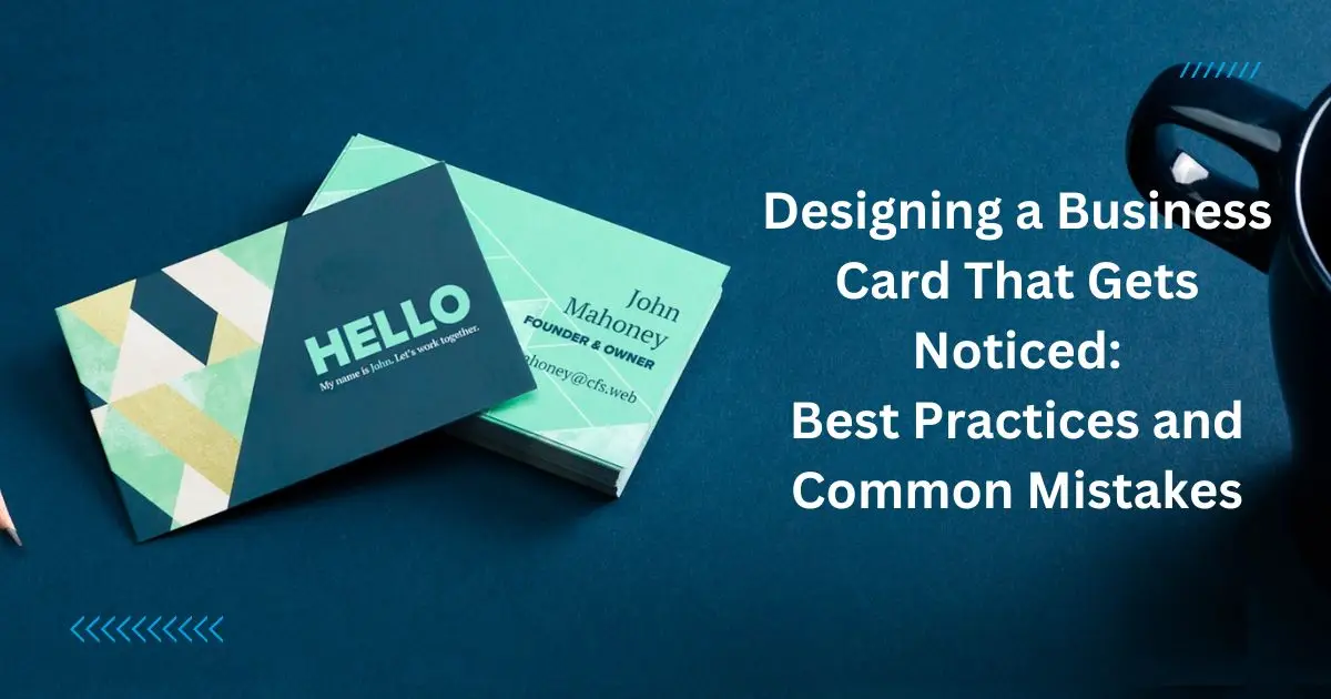
Unlock the Power of Your First Impression with Business Card Design
In the world of networking and professional meet-ups, business cards hold the power to leave a lasting first impression. A split-second glance at your card can either open the door to future possibilities or lead to your card being lost in the shuffle. So, let’s dive into the art of creating business cards that not only stand out but are designed to ensure maximum visibility and impact.
Clarity Is Key: Keep It Simple and Straightforward
When it comes to business cards, clarity is your best friend. A card crammed with too much information or complex graphics can confuse potential connections. To ensure your card speaks volumes without shouting, follow the “less is more” approach. Stick to simple designs and choose a clear, readable font. Reserve the card real estate for your key details: name, title, company, phone number, and email address. If your brand runs on a unique slogan or services, introduce it succinctly to make an impactful statement.
Brand Identity: Let Your Card Tell Your Story
Your business card is a silent ambassador of your brand. Every choice, from colors to typography, should reflect your company’s personality and ethos. Consistent branding creates an immediate link in people’s minds; when they see certain colors or logos, they’ll think of you. If your brand is vibrant and energetic, let your colors be bold. If it’s more about trust and reliability, opt for deeper, reassuring tones. Remember, staying true to your brand’s identity helps reinforce its presence in the crowded market of networking.
Embrace Negative Space: The Art of Breathing Room
Just as a neatly organized room is more inviting, a business card with ample negative space is more appealing and easier to digest. Negative space, or the “blank space” around your card’s elements, isn’t wasted—it’s incredibly valuable. It helps the beholder’s eye to focus on what’s important without feeling overwhelmed. So don’t be afraid to let your card “breathe” by avoiding the urge to fill every square inch. Embracing negative space makes for a sophisticated and professional look that conveys confidence and composure.
Material Matters: Choose Wisely
The physical feel of your business card can be as influential as its visual appeal. A sturdy, high-quality material speaks volumes about the professionalism and quality of your business. Paper choice is vast—from matte to glossy, textured to linen—and each carries its unique vibe. Consider also unconventional materials like wood, metal, or even recycled goods to stand out. However, make sure the material aligns with your industry and message, as it’s yet another narrative tool of your branding.
The Power of Touch: Embossing and Other Textures
To add a sense of luxury and depth to your cards, consider using embossing, foil stamping, or spot UV coatings. Textural elements not only look good but offer a tactile engagement that can make your card more memorable. Human beings are multisensory; when your card appeals to more than just sight, it engages more deeply. Just ensure that these special finishes accentuate rather than overpower your card’s overall design and readability.
A Picture Speaks a Thousand Words
For certain industries, a visual element can be a game-changer. A high-quality image or professional headshot can add personal connection and recognition, especially for service-based professions. Images should be high-resolution and relevant to your industry, reinforcing the card’s message rather than detracting from it. Nevertheless, tread carefully; images take up space, and like all other card elements, they should be balanced to maintain the card’s effectiveness.
The Color of Success: Choosing Your Palette
Colors trigger emotional responses, and in business card design, color psychology is an invaluable tool. A color that stands out in a wallet full of cards might be all it takes to get a second glance. Ensure the palette you choose complements and reinforces your brand’s message: blues for professionalism and stability, reds for excitement and urgency, greens for growth and freshness, and so on.
However, always aim for balance. A strong color can be an asset, but overused, it becomes a liability. And for text, contrasting shades ensure legibility—a crucial feature for any business card.
Go Beyond Traditional Rectangles
Who says business cards have to be rectangular? Die-cut processes allow you to create cards of various shapes relevant to your business. A bakery might have a cupcake-shaped card; a photographer, a card shaped like a camera. This uniqueness can set you apart, but it’s important to remember practicality—unusual shapes can be memorable but make sure they still fit comfortably in a wallet or cardholder.
Test Before You Print: Prototype Is Your Friend
Before you launch into printing hundreds of cards, create prototypes. Test different designs, materials, and finishes; solicit feedback from trusted colleagues or friends. Ensure readability in various lighting situations and that the design resonates with the message you want to impart. A tested and refined card is more likely to succeed when you finally hand it out.
Conclusion: Your Card Is Your Handshake

In the universe of networking, your business card can be as influential as a firm handshake. With the right design approach, you can craft a card that not only introduces you but also speaks volumes about the professionalism and uniqueness of your business.
Design with intention, focus on readability, reinforce your brand, and favor quality over quantity. Small details can make a big difference — the choice of texture, the use of color, the inclusion of negative space, and the thoughtful selection of material are all pivotal.
Remember, you want your card to be the one that sticks in someone’s memory and the one they’re excited to share with others. Crafting a business card with maximum visibility is about seizing that split second and making it count. Keep these tips at the forefront of your design process, and watch as your little piece of cardstock opens the doors to vast opportunities.
